Recently, I was helping a client figure out why his web site was not getting many opt-ins, despite lots of traffic. Being as research and fact oriented as I am (I now know this because I just took the Kolbe Personality Test; I highly recommend it for you and your staff – more on that next month), I started to dig into the research. I had always heard that it takes seven seconds to make a first impression, but I soon found out that only applies to in-person encounters. The stats on websites are much different.
First Impressions are Always True
The results were mind-boggling. Seven seconds is an eternity compared to the amount of time it takes to make an impression in the super high-speed world of the Internet. It takes shockingly less time than seven seconds…try 50 milliseconds! That’s 1/20 of a second for us non-math people.
Think about it. Your brain has formed an impression of a website almost before you are conscious to the fact that you are even looking at a website! Not only do people form an impression of your website precognitive of the fact that they are on a website, but their first impression tends to have a lasting impact.
Research shows that people still maintained their initial favorable impression after further exploration. This has something to do with what psychologists call the Halo Effect…based on the fact that people like to be right! Their continued belief that the website is trustworthy and reputable confirms that their initial impression was correct. The reverse is true as well. Research shows that we are less likely to trust a website that we perceive as unappealing, and we will leave it in favor of others.
We know the importance of a good first impression. Areas that are important to people as they formulate their opinions are color and visual complexity. Websites with a medium level of visual complexity scored highest on the popularity/favorable first impression scale.
Translation: Do not put too many things on your homepage. Less is more in this arena. Have a good amount of white space and just enough complexity to keep it interesting.
Just One Thing
Think about what your website is there to do:
- Is it just for information?
- Are you selling supplements?
- Or is your objective to collect names to grow your list?
Whatever your objective is, everything you have on your homepage should be designed to get your visitor to do just one thing. One of the biggest mistakes we can make is to try to get our visitors to do too many things. A confused mind will always say, “NO”, so do not give your visitors too many choices.
Know Where They Go
People pay the most attention to the headline, which actually gets the most play, I might add. The studies reveal that people look at your website in an “F” pattern. Skimming the top of the page, the eye then tracks down the left side of the page, and about half way down, moves to the center of the page. So logically, this is where to put the stuff that we want them to read and act on.
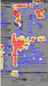 Put your best stuff within the top third of the page, referred to as “above the fold”, which means that is the area the visitor sees when they first land on your page. This is the place to put your best stuff.
Have your opt-in box up here (upper right hand side is best), but remember to give your readers a reason to scroll down below the fold to see what else you have in store for them.
It is like playing with a cat. My usually-distant-very-independent cat will suddenly go anywhere I like; all I need to do is shine a flashlight around on the floor. She will chase that little light anywhere! Craft your copy so that it leads your reader through your website, sort of like a cat chases one of those little feather toys that you control on a stick.
And remember to keep your copy short and sweet. Bullet point your stuff; condense. Less is more. Jason Fried, founder of 37 Signals, says this about web copy:
- Short paragraphs get read
- Long paragraphs get skimmed
- Really long paragraphs get skipped
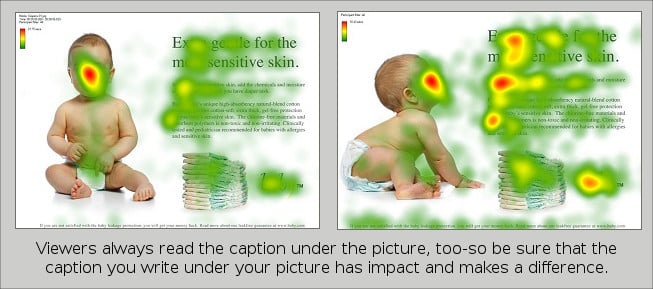
Another thing people love to look at on a website is a picture…not a stock picture either. A real picture of real people. Also note that people prefer looking at faces. 3 Real faces are best, and if you want people to look somewhere, use a face looking at the copy you want them to read…this really works like magic according to the infared observer. Notice the picture of the baby below. See how much more the copy is read when we see that the baby’s line of sight is leading us there?
Gift Them on Your List
For most of us, our objective is to get people on our list. We want them to join our tribe, to be a part of our community. In order for us to get them to invite us into their precious in-box, we need to give them an incentive to do so, and usually this takes more than being a brilliant writer or a nice person. You need a good old-fashioned bribe! And whatever you do, don’t say, “Sign up for my free newsletter!”; ten years ago that was enough to get a potential client’s email. In this day of information overload, that’s about the last thing they want- another newsletter cluttering up their in-box.
Think about what your clients might really want, and create a free gift based on that. Give them great stuff, something they might even pay for… but give it for free. This way they will think,“ If THIS is the free stuff, what is the stuff like that I actually pay for?!”
Your Website is Never Done!
Yep, it’s true. Just like Google search and the ever-changing algorithms, we need to change with the times. Test and re-test and see what works best. Observe the websites of successful businesses and see what they are doing. See what is appealing to you about their website. Model (the operative word here) do NOT copy what they are doing. What websites do you opt-in to and buy from? That’s good market research!
References:
- Lindgaard, G., Fernandes, G., Dudek, C., and Brown, J. Attention Web Designers: You Have 50 Milliseconds to Make a Good First Impression! Behaviour & Information Technology 25, 2 (2006), 115–126.
- Predicting Users’ First Impressions of Website Aesthetics With a Quantification of Perceived Visual Complexity and Colorfulness Lindgaard, G., Dudek, C., Sen, D., Sumegi, L., and Noonan, P. An Exploration of Relations Between Visual Appeal, Trustworthiness and Perceived Usability of Homepages. ACM Transactions on Computer-Human Interaction 18, 1 (2011).
- Neilsen, J. (2010, February 01). Photos as web content. Retrieved from http://www.nngroup.com/articles/photos-as-web-content/